So-Me is a Parisian art director of Ed Banger Records and his real name is Bertrand Lagros de Langeron. Langeron is better known by his ego "So-Me". He never thought he would be nominated for an MTV Video Music Award. "I wouldn't know why they would nominate these French boys nobody knows," he explains. So-Me's funky visual is mostly the reason for making Ed Banger well known as it is for introducing hard-rockin' Parisian dance duo Justice into hipster-blog stardom. So-Me's humorous, punk-meets-graffiti imagery has created a cultural identity for the label that recalls how Peter Saville's distinctive minimalism defined New Order's Factory Records.
"We're playing with the format of pop," So-Me says. "we don't want to be George Michael or Michael Jackson. It's not commercial for the masses, but pop in the way we mis everything we want the music to be as important as the graphics, and vice versa."
This is the video that So-Me created and has been nominated for the MTV Video Music Award.
This evening I was sitting in the library doing some research the sky drew my attention. It was like the whole sky is a big huge rainbow. I quickly took a picture (as seen on above). On the way home I happened to see a tree without leaves outside the campus. The tree was black only the lights from behind it. It quickly gave me an inspiration and here's the outcome. =]
I ran into this website while looking for tutorials for my project. There are many things I could discover and quite inspiring. When you ran out of inspiration give this website a shot!
The 1st art related competition that I have recently participated has finally announced the results. Thursday afternoon I checked my mail and got a mail from lunartik. It says:
Well Done Janet Thank you for entering the lunartik and spaghetti junction competition! You are the 2nd prize winner! The 2nd place prize is An artist pass! You can pick which pass you want from http://www.lunartik.com/lunartikshop/ Can you email me your address so the prize can be posted to you? Thank you again for entering and congratulation on coming second! Joe Taylor Design Editor Spaghetti Junction
I can't believe it! I got the 2nd place! I was excited for a second but I just couldn't believe it. I wasn't expecting anything like this when I participated the competition. I thought it must be some kind of prank, so I asked my brother for advice and we searched and searched until I found this link here. Its on flickr! It says I'm in the 2nd place! Now I'm seriously excited. Although the competition wasn't really big and there weren't many competitors but I'm really happy to get a 2nd place. What an experience! Having a chance to be in the front and some more I wasn't expecting this made a lot more wonderful!
It is really frustrating when you have to come with something when you can't think of anything and the deadline is near, but my head is going to explode soon for I can't come up with anything. What I tend to do is google and doodles. I google on some images relating what I am doing, screen through some pictures and go here and there looking at pictures for inspiration. At the same time I doodle around my sketch book think hard what can I do with the shapes and everything else. Slowly from a circle I get a figure, gradually that's how the final piece gets done. Doodles and images, my source of inspiration.
In this sketch here I am trying to design a signage for toilets. Male and female, I thought hard how to make it interesting and my target audiences are mainly students in the Uni and also visitors. As you can see in my sketch, I came up with figures of a man and a woman which I thought is quite nice and elegant but, I decided to leave that for maybe something in the future and tried to do something rather humorous and young. In this signage I have thought a lot about the characteristics of man and female and tried to emphasize on it.
The male I sketched a man standing urinating and for the woman I sketched a woman sitting. I got this idea when I was trying to get something from what people do in the toilet and how can I make this to be recognizable immediately without direct lettering. I thought that the big difference between man and woman using toilet is this and it would be quite interesting and fun to see the urinating signage, you might say man sits too, and that is why i had the female's chest illustrated broader.
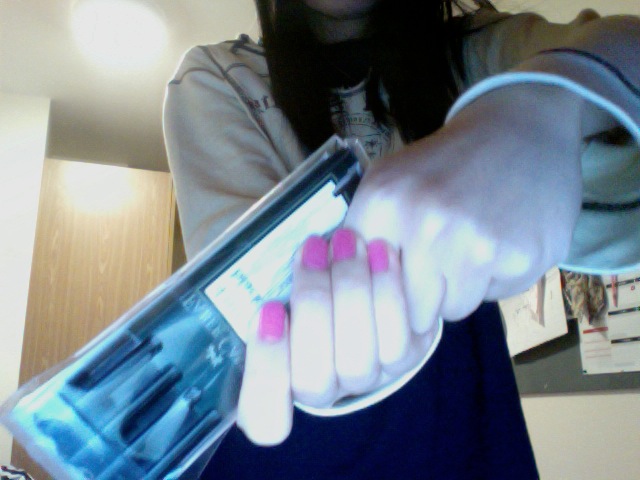
This is my first piece of art after the previous two drawing practices. Its hard for me to get everything right, I had to erase and redraw, experimenting with colors and I even took a picture of my own hands to get the gestures right. I am looking forward to experiment with different techniques and styles.
I wanted to practice on my figure studies and drew my friend. Im really not satisfied with this, the shading and the proportion are all wrong. I'll have to practice more, hope I'll get it right someday!


